Free calculator plus the industry standard formula for making business signs people can actually read from the road
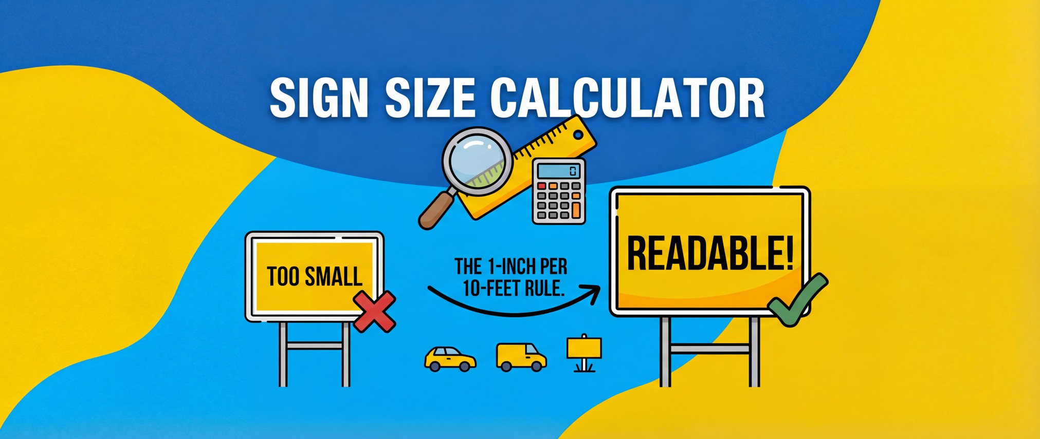
The Formula: 1 inch of letter height = 10 feet of viewing distance
City Streets (35 mph): Minimum 5 inch letters for 50 foot readability
Parking Lots: Minimum 2.5 inch letters for 25 foot readability
Best Color Combo: Black text on yellow background (highest contrast)
Font Recommendation: Arial Black or similar bold/heavy weight
Industry Source: United States Sign Council (USSC) standards
Use the Free Sign Size Calculator
Let me paint you a picture.
You just dropped $150 on a beautiful set of door magnets for your work truck. The design looks sharp. Your phone number is right there in bold. You slap them on, cruise through town feeling like a marketing genius... and exactly zero people text you.
Not one lead. Not even a wrong number.
Here's what happened: your sign looked fantastic from three feet away, in a parking lot, while standing still. But to drivers passing at 35 mph? Your phone number was a meaningless blur. They literally couldn't read it.
This is the costly mistake that burns small business owners every single day. And it's 100% avoidable once you understand the industry standard formula that highway departments, commercial sign companies, and outdoor advertisers have used for decades.
This guide covers everything you need to know: the legibility formula, vehicle size constraints, color contrast science, typography specifications, and a free calculator that does all the math for you.
The 1 inch per 10 feet rule is the industry standard formula for sign legibility. It means that for every 10 feet of viewing distance, you need 1 inch of letter height.
The formula in practice:
2 inch letters = readable from 20 feet
5 inch letters = readable from 50 feet
10 inch letters = readable from 100 feet
This standard comes from the United States Sign Council (USSC) and is based on the same principles behind the Snellen eye chart used by optometrists. The formula assumes a viewer with average 20/20 vision in reasonable lighting conditions.
Highway departments use this rule. Outdoor advertising companies use this rule. Commercial sign shops use this rule. It's the universal standard for sign legibility.
The 1 inch per 10 feet rule assumes the viewer is stationary or moving slowly. When vehicles are traveling at speed, you need even larger letters because:
Parking lots and pedestrian areas are your easiest viewing scenario. At walking speed or slow driving, a 25 foot viewing distance is realistic, which means 2.5 inch letters will do the job.
Residential streets at 25 mph give drivers a bit more time but less proximity. Plan for 40 feet of viewing distance and use 4 inch letters minimum.
City streets at 35 mph are where most vehicle signs need to perform. You're looking at 50 feet of realistic viewing distance, so 5 inch letters are your minimum. This is the sweet spot for SUVs, pickups, and minivans.
Arterial roads at 45 mph push viewing distance to 70 feet, requiring 7 inch letters. Only pickup trucks and larger vehicles can physically fit letters this size.
Highways at 55+ mph demand 100 foot viewing distance and 10 inch letters. Only cargo vans and box trucks have the surface area to make this work. Your sedan simply cannot play here.
Your vehicle type sets hard physical limits on sign dimensions. The door panel or body surface determines maximum sign width and height, which then constrains the maximum letter size.
Cars and Sedans have the most limited real estate. You're working with a maximum sign size of about 24 inches wide by 12 inches tall. After accounting for two lines of text plus spacing and margins, your letters max out around 3.5 inches tall. That gives you roughly 35 feet of viewing distance. Perfect for parking lots and stopped traffic, but forget about highway visibility.
SUVs give you more to work with. Expect maximum dimensions around 30 inches wide by 18 inches tall, allowing for 5 inch letters and 50 feet of viewing distance. This covers most city driving scenarios nicely.
Minivans are similar to SUVs but slightly wider. You can fit signs up to 36 inches wide by 18 inches tall, still maxing out at about 5 inch letters and 50 foot visibility.
Pickup Trucks are where things get interesting. Door panels and tailgates can accommodate signs up to 48 inches wide by 24 inches tall. That means 7 inch letters and 70 feet of viewing distance. You're now visible on faster arterial roads.
Cargo Vans and Service Vans are workhorses for signage. With up to 60 inches wide by 30 inches tall of usable space, you can fit 8.5 inch letters and achieve 85 feet of visibility. Close to highway readable.
Box Trucks offer the most real estate at 96 inches wide by 30 inches tall. Same 8.5 inch letter height as cargo vans (height is the limiting factor), but you have much more horizontal space for longer messages or larger graphics.
Key insight: A sedan physically cannot achieve highway visibility. The door panel is too small to fit 10 inch letters. Sedan owners should target parking lots and stopped traffic instead.
Most business signs need two lines of text, such as:
TEXT QUOTE TO 555-123-4567
Two lines require vertical space for both lines plus line spacing plus margins. The formula:
Total height needed = (2 × letter height) + (30% of letter height for spacing) + margins
On a 12 inch tall sign (typical sedan door panel), this limits you to approximately 3.5 inch letters after accounting for spacing and margins.
Longer text means smaller letters. A phone number with area code is 10 characters. Add "TEXT QUOTE TO" and you have about 20 characters total.
Each character needs horizontal space plus letter spacing. If your text is too long to fit at your desired letter height, the calculator will reduce the letter size to fit the available width.
Color contrast affects sign legibility almost as much as letter size. Poor contrast can reduce effective viewing distance by 50% or more.
Human eyes detect differences in brightness (luminance) more easily than differences in color (hue). This is why black on yellow works so well: yellow has the highest luminance of any saturated color, and black has the lowest. The combination maximizes the brightness differential.
The WCAG accessibility standards require a minimum contrast ratio of 4.5:1 for normal text. Traffic signs aim for 10:1 or higher. Black on yellow achieves approximately 19:1.
Black on Yellow is the undisputed champion with a 19:1 contrast ratio. There's a reason every traffic warning sign uses this combination. If maximum visibility is your goal and aesthetics are secondary, this is your answer.
Black on White delivers a 21:1 contrast ratio in a classic, professional package. This is the most versatile choice for businesses that want to look polished while maintaining excellent readability.
White on Black also hits 21:1 contrast but with a modern, bold aesthetic. It stands out visually and works particularly well on darker vehicles where the sign itself becomes a design element.
Dark Blue on White offers good contrast with a more professional, corporate appearance. Popular with service businesses that want to project trustworthiness.
White on Dark Blue flips the previous combination and works equally well. Slightly more eye catching while maintaining readability.
Yellow on Black rounds out the top tier. High contrast with strong visual impact, though slightly less readable than black on yellow due to how the eye processes light text on dark backgrounds.
These combinations look acceptable on screens but fail at distance:
Red on blue (low luminance contrast despite different hues), orange on red (adjacent hues, similar luminance), light gray on white (insufficient contrast), and any light color on another light color.
Vehicle Vinyl Decals: The vinyl is cut letters only with no background. Your vehicle paint IS the background. Dark vehicles need yellow or white text. Light vehicles need black or dark blue text.
Vehicle Magnets: You control both the magnet background and text color. Choose a background that contrasts with your vehicle color, then text that contrasts with the background.
Yard Signs: Full control over background and text. Black on yellow is optimal for maximum visibility.
Telling a print shop "make it as big as possible" is incomplete. Here are the specifications that matter:
Letter Height is your primary specification. This is the vertical measurement of capital letters and directly determines viewing distance. When you tell your print shop "4.5 inch letters," this is what you mean.
Letter Width is typically calculated as 70% of letter height for most fonts. Bold and black weight fonts run wider (closer to 80%), while condensed fonts run narrower (50 to 60%). Our calculator uses 70%, which matches Arial Black and standard highway signage fonts.
Letter Spacing (also called tracking) controls the gaps between characters. Too tight and letters blur together at distance. Too loose and words fall apart visually. The standard is 10% of letter height. Phone numbers often need slightly more spacing because digits are narrower than letters.
Line Spacing (also called leading) determines vertical separation between your two lines of text. Too tight and the lines merge into each other from a distance. The standard is 30% of letter height between the baseline of one line and the top of the next.
Stroke Width is the thickness of the lines that form each letter. This is critical for vinyl cut signs because strokes that are too thin won't survive the cutting and weeding process. The minimum is 12 to 15% of letter height. Bold fonts like Arial Black have appropriate stroke width built in.
Margins create breathing room between text and sign edges. This prevents your text from looking cramped and protects against slight misalignment during installation. Standard is 5% of letter height on all sides.
Font recommendation: Arial Black or similar bold/heavy weight fonts. Regular weight fonts have thin strokes that disappear at distance. Bold fonts have built in stroke width appropriate for signage.
Best for: Personal vehicles used part time for business, employees who prefer no permanent branding, testing designs before vinyl, businesses with multiple drivers using personal vehicles.
Limitations: Can detach at highway speeds if undersized, won't adhere to plastic panels or curved surfaces, shorter lifespan than vinyl.
Cost: $25 to $75 per pair
Lifespan: 1 to 3 years
Best for: Dedicated work vehicles, permanent branding, professional flush appearance, larger coverage areas.
Limitations: Removal may damage older paint, vehicle color limits text color options, professional installation recommended for large pieces.
Cost: $50 to $200
Lifespan: 5 to 7 years
Best for: Job site advertising, directional signage, temporary placement, high volume campaigns.
Limitations: Requires ground stakes, can blow over, may need permits, not legal in road rights of way.
Cost: $5 to $20 each
Lifespan: 6 to 12 months outdoors
Personal car, occasional business use? Start with vehicle magnets. They're removable, affordable, and let you test your messaging before any permanent commitment.
Dedicated work truck or van? Go with vinyl decals. The professional appearance and 5 to 7 year lifespan justify the higher upfront cost.
Working multiple job sites at once? Yard signs are your answer. At $5 to $20 each, you can blanket an area affordably.
Not sure what works best? Start with magnets to test your design and messaging, then upgrade to vinyl once you've dialed everything in.
The calculator at app.smsforms.io/tools/sign-calculator.html automates all the math. Here's how to use it:
Step 1: Select sign type (vehicle magnet, vinyl decal, or yard sign)
Step 2: Choose vehicle type (sets maximum dimensions)
Step 3: Enter your sign text (trigger word and phone number)
Step 4: Set desired viewing distance (25, 50, or 100 feet)
Step 5: Select colors (calculator shows contrast ratings)
Step 6: Review results (preview, specs table, achievable distance)
Step 7: Download files (SVG for print shop, PDF spec sheet)
Pro tip: Bring the SVG file to your sign vendor. It contains exact proportions that scale perfectly to any size.
Mistake #1: Prioritizing aesthetics over legibility. That elegant script font looks beautiful on a business card. On a vehicle door moving past someone at 35 mph? Completely unreadable. Save the fancy typography for print materials people hold in their hands. Signs need bold, simple fonts that can be processed in two seconds.
Mistake #2: Cramming in too much information. Business name, tagline, phone number, website, email, list of services, "Licensed & Insured"... stop. Every additional element shrinks everything else and creates visual chaos. One call to action only. "TEXT QUOTE TO 555-123-4567" is complete. Anything more works against you.
Mistake #3: Ignoring your vehicle color. White vinyl text on a white van is effectively invisible. Seems obvious, but people do this all the time because they're looking at the design on a computer screen, not thinking about how it appears on their actual vehicle. Always choose text colors based on your real vehicle color.
Mistake #4: Overestimating achievable viewing distance. "I want people on the highway to see my sign" sounds great until you realize your Camry door panel can only fit 3.5 inch letters. Accept the physical constraints of your vehicle and target appropriate scenarios. A sedan excels at parking lot and stopped traffic visibility.
Mistake #5: Using regular weight fonts. The difference between Arial and Arial Black is the difference between visible and invisible at 50 feet. Regular weight fonts have thin strokes that disappear with distance. Always specify bold, heavy, or black font weights.
Mistake #6: Forgetting about sign placement. You designed a beautiful driver's side door magnet, but your truck spends 8 hours a day parked on the street with the passenger side facing traffic. Think about where your vehicle actually sits most often and prioritize accordingly. Better yet, get signs for both sides.
Mistake #7: Skipping the proof. You gave the print shop your specs, but somewhere between your instructions and production, something got lost in translation. Maybe the font changed. Maybe the colors shifted. Always request a scaled proof before final production, and physically measure it against your specifications.
What to Bring: The SVG file from the calculator gives your print shop exactly what they need. Include the PDF spec sheet as a backup reference, and bring photos of your vehicle showing where you plan to mount the signs. This prevents any confusion about dimensions or placement.
Questions They'll Ask: Magnet or vinyl? What vehicle make and model? Do you need professional installation (for vinyl)? How many signs? Any rush on timing?
Pricing to Expect: Vehicle magnets typically run $25 to $75 for a pair of door signs. Vinyl decals range from $50 to $200 depending on size and complexity. Yard signs cost $5 to $20 each with significant discounts on orders of 10 or more.
Turnaround Times: Simple magnets and small vinyl pieces take 1 to 3 business days. Custom or complex work takes 3 to 7 business days. Bulk yard sign orders typically take 5 to 10 business days.
Quality Check Before Accepting: Verify colors match your request (compare to the original design file, not your memory). Confirm all text is spelled correctly. Measure the sign against your specifications. Inspect for bubbles, wrinkles, peeling edges, or other defects in the material.
The industry standard is 1 inch of letter height for every 10 feet of viewing distance. This formula comes from the United States Sign Council (USSC) and is used by highway departments and commercial sign companies.
Letter size depends on your vehicle and target viewing distance. Sedans max out at about 3.5 inch letters (35 foot visibility). SUVs and pickups can fit 5 to 7 inch letters (50 to 70 foot visibility). Cargo vans and box trucks can fit 8.5 inch letters (85 foot visibility).
Black text on a yellow background provides the highest contrast and best visibility. This is why traffic warning signs use this combination. Black on white and white on black are also excellent choices.
No. The physical size of sedan door panels limits letter height to approximately 3.5 inches, which provides about 35 feet of visibility. Highway visibility requires 10 inch letters, which only fit on cargo vans and box trucks.
Use bold, heavy, or black weight fonts such as Arial Black. Regular weight fonts have thin strokes that become invisible at distance. The minimum stroke width for legible signage is 12 to 15 percent of letter height.
With proper care, vehicle magnets last 1 to 3 years. Vinyl decals last 5 to 7 years. Yard signs last 6 to 12 months with outdoor exposure.
SVG (Scalable Vector Graphics) is the preferred format. It contains exact proportions that scale to any size without losing quality. The sign size calculator provides a downloadable SVG file with your specifications.
If your sign is unreadable from expected distances, the letters are too small, the color contrast is too low, or both. Use the 1 inch per 10 feet rule to calculate required letter height, and choose high contrast colors like black on yellow.
Getting sign size right comes down to these principles:
Use the Free Sign Size Calculator
No signup required. Get your specifications in under two minutes.
This calculator is provided free by SMSForms.io, an SMS lead capture service for contractors and local service businesses. When someone texts your trigger word to your business number, they receive automated questions that collect contact info, project details, timeline, and photos. Completed leads are emailed directly to you. The sign calculator works for everyone, whether you use the SMS service or not.
Customers prefer texting! Join businesses that are capturing better leads with intelligent SMS conversations.